Brand Identity Design Guide for Indian Businesses in 2026: From Logo to Full Brand System
Why Brand Identity is Your Most Valuable Business Asset
In 2026, Indian consumers interact with dozens of brands daily — on Instagram, Google, WhatsApp, and in physical stores. The businesses that capture attention, earn trust, and command premium pricing all share one thing: a strong, consistent brand identity.
Brand identity is far more than a logo. It is the complete visual language of your business — the colors that evoke specific emotions, the typography that communicates your personality, the imagery style that defines your world, and the design system that keeps everything consistent across every touchpoint. Together, these elements create the instant recognition that turns first-time visitors into loyal customers.
A study by Lucidpress found that consistent brand presentation across all channels increases revenue by up to 33%. For Indian businesses competing in crowded markets, strong brand identity is not a luxury — it is a competitive necessity.
It takes consumers only 7 seconds to form a first impression of your brand. Your visual identity determines whether that impression is positive or forgettable.
Step 1: Define Your Brand Strategy Before Designing Anything
The biggest mistake Indian businesses make is jumping straight to logo design without first defining their brand strategy. A beautiful logo built on a vague strategy is like a beautiful storefront with no products inside.
Your brand strategy answers three foundational questions: Who are you? (Brand purpose and values), Who are you serving? (Target audience — their demographics, aspirations, and pain points), and How are you different? (Unique positioning in a crowded market).
For Indian brands, authenticity and cultural resonance are particularly powerful. A fashion brand that celebrates Indian textiles and artisanship, a fintech that speaks the language of the aspirational middle class, or a health brand rooted in Ayurvedic wisdom — these brands succeed because their identity is deeply connected to a specific cultural truth that resonates with their audience.
- →Brand Purpose: Why does your business exist beyond making money?
- →Target Audience: Age, income, aspirations, digital habits, regional context.
- →Brand Personality: Choose 3–5 adjectives (e.g., bold, trustworthy, playful, premium).
- →Competitive Positioning: What gap in the market do you occupy?
Step 2: Logo Design — The Foundation of Visual Identity
A great logo is simple, memorable, versatile, and timeless. It must work at 16px as a favicon and at 3 meters on a billboard. It must look as good in black and white as it does in full color. And it must communicate your brand personality in a single glance.
For Indian businesses, consider the cultural weight of visual symbols. While global logos tend toward minimalism, Indian audiences also respond strongly to logos that incorporate cultural motifs, traditional craftsmanship references, or bold, confident color choices that stand out against India's visually rich landscape.
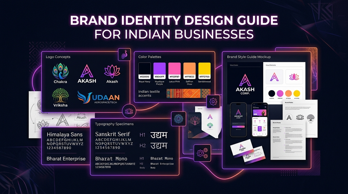
The three most effective logo styles for Indian businesses in 2026 are: Lettermark logos (using stylized initials — clean, professional, highly versatile), Combination marks (logo + wordmark together — best for brand recognition in early stages), and Abstract marks (geometric symbols that grow into recognizable brand icons — requires sustained brand-building investment).
- →Deliver logos in SVG, PNG (transparent), and PDF formats.
- →Create full-color, reversed (white), and monochrome (black) versions.
- →Test legibility at 16x16px (favicon size) and 500x500px minimum.
- →Avoid gradients that disappear when printed in black and white.
- →Trademark your logo — file for TM registration on the IP India portal.
Step 3: Color Psychology for Indian Brands
Color is the most emotionally powerful element of brand identity. Colors evoke specific psychological responses that can attract or repel your target audience. For Indian brands, color choices must balance universal color psychology with India-specific cultural associations.
Blue is the most trusted color globally and is ideal for fintech, healthcare, and B2B brands (HDFC Bank, Flipkart, Paytm). Saffron and orange communicate energy, warmth, and optimism — deeply resonant in Indian culture and used by Swiggy and Amazon India. Green signals growth, health, and naturalness — perfect for agriculture, organic food, and environmental brands. Red commands attention and urgency, widely used in e-commerce for sale promotions.
For premium Indian brands, deep navy or forest green combined with gold accents creates a powerful luxury aesthetic — think Tanishq's visual language. For startup and tech brands, purple gradients, electric blue, and dark backgrounds signal innovation and digital-first thinking.
Color increases brand recognition by up to 80%. Choose colors that are both emotionally aligned with your brand values and culturally resonant with your Indian audience.
Step 4: Typography — The Voice of Your Brand
Typography communicates personality before a single word is read. Serif typefaces (like Playfair Display or EB Garamond) convey authority, heritage, and premium quality — ideal for legal firms, luxury brands, and established institutions. Sans-serif typefaces (like Plus Jakarta Sans, Outfit, or DM Sans) communicate modernity, accessibility, and digital-first thinking — the standard for startups and tech companies.
For Indian brands serving bilingual audiences, choose typefaces with strong Devanagari or regional script support alongside their Latin counterparts. Google Fonts offers excellent options: Poppins pairs beautifully with its Devanagari variant for Hindi, while Noto Sans supports virtually all Indian scripts.
Establish a clear typographic hierarchy: One primary display typeface for headlines (should be distinctive and brand-representative), one secondary typeface for body copy (prioritize legibility at small sizes), and consistent sizing ratios (e.g., H1: 3.5rem, H2: 2.5rem, Body: 1rem).
Step 5: Brand Guidelines — The Document That Scales Your Brand
A brand guidelines document (also called a brand style guide) is what transforms a collection of design assets into a consistent, scalable brand system. It is the rulebook that ensures your website, packaging, social media, business cards, and presentations all look like they belong to the same family — whether designed by you, your team, or a vendor in another city.
Your brand guidelines should include: Logo usage rules (do's and don'ts, minimum sizes, clear space requirements), complete color palette with HEX, RGB, and CMYK codes, typography specifications for digital and print use, photography and imagery style guidelines, and examples of correct brand application across common touchpoints.
Deliver your brand guidelines as both a PDF for sharing and an editable Figma file for future design work. Share this document with every vendor, freelancer, or employee who creates branded content for your business.
- →Logo: Full color, reversed, monochrome versions with usage rules.
- →Colors: Primary palette + secondary palette + do-not-use colors.
- →Typography: Font families, weights, sizes, and line spacing.
- →Imagery: Photo style, illustration style, icon style guidelines.
- →Voice & Tone: Writing style guidelines to match visual identity.
Ready to Grow Your Business Online?
AV Web Services builds websites, AI systems, and SEO strategies that deliver real results. Get a free consultation today.